Using the weDevs Logo
Safe Space
The weDevs logo must be used with safe space. Please maintain the space when using the logo on your site or any other material. Use half the logo's width to determine the minimum amount of safe space that should surround the Logo.

Minimum Size
The logo “weDevs” should always be easy to read. So in digital content the Logo should never appear smaller than 24dp in height.
The minimum size for applying the Logo in print is 0.125 in/3.1 mm in height.

What Not to Do with the Logo
The weDevs Logo is a symbol people recognize, so it should never
be altered.
Here are a few examples of what not to do with the weDevs
Logo

Do not outline

Do not rotate

Do not distort proportions

Do not shear or skew

Do not apply effects

Do not alter letter spacing

Do not use a gradient

Do not use any off-brand color
Using The
Logo on
Solid
Backgrounds
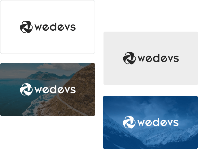
These examples show the correct application of the weDevs Logo on different solid backgrounds. The almost black full-color Logo should be used on a background that’s lighter than 15% gray. The white full-color Logo should be used on a background that’s darker than 50% gray.


Monochrome Logo
If a background color makes the full-color Logo hard to see, you should use a monochrome Logo instead. The almost black (#282828) monochrome Logo contains a white triangle in the Icon. It should be used on light multi-colored images. The white (#FFFFFF) monochrome Logo has a no-fill triangle. It should be used on dark multi-colored images.
Name Spelling
When referencing our company in writing, weDevs is always written as a single word with w lowercase and D an uppercase.
Brand Colors
Here are some brand colors of weDevs Theme, Logo & Website. These
is the handpicked
combination of colors we’d love to see while promoting
weDevs!


