How To Use Pop-ups on Your eCommerce Store
Utilizing pop-ups in the right way can give your website the lifts it needs. In fact, a good pop-up on your website not only helps your users to make a choice but also assists you to grow your business.
However, pop-ups have both good & bad sides. If you can't utilize popup in the right way, all your efforts & tactics might end up losing a customer who’s already ready to buy your products or services.
In today's post, we're going to share some important facts regarding pop-ups on your business websites. Following this guide, you'll easily be able to apply pop-ups on your eCommerce store to reduce cart abandonment and drive more conversions.
Moreover, a detailed pop-up implementation process got discussed with live examples as well.
Without further ado, let’s get started with this basic question.
What Does Website Pop-up Mean & How It Work?
In simple words- pop-ups on websites or any eCommerce site mean a graphical user interface section that suddenly comes up (Pop-ups) on your display at any particular part of the website or store product page.
Pop-up appears after hovering the mouse cursor on a particular part of the page, navigating the page or base on spending times (10 seconds, 30, and 60) on that website
– My Opti mind
Here's is an example of a pop-up below:-
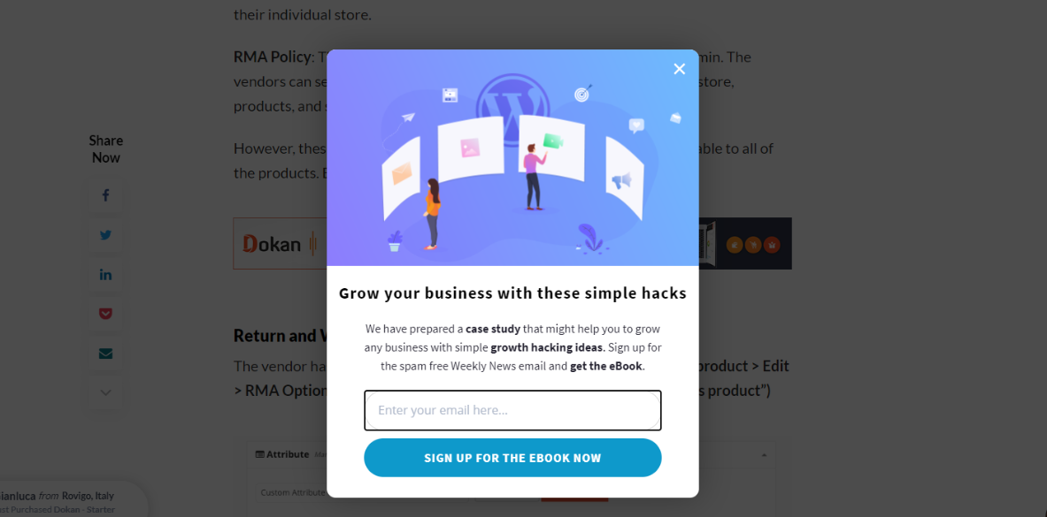
However, it may bother or irritate you if it appears again & again at the time of browsing websites. That's why 73% of internet users dislike or avoid pop-up ads while visiting or searching for anything on the website.
But in this regard, Search Engine Land expressed some different things about pop-ups. They said:-
Smartly utilized pop-ups have the ability to increase conversion rates by 6.39% & generate leads up to 2000 monthly
And there are different types of pop-ups you may notice on different websites. So let's talk about them shortly.
Here, we've listed out five unique types of pop-ups which include:
- Click Pop-Ups: Click-Pop-Ups work when users click on a designed link or image of your website or landing page.
- Timed Pop-Ups: After you spend some time on any website or store, timed Pop-Ups began to work (shows up). In this case, the admin of the site set the time for this pop-up to appear.
- Scroll Pop-Ups: After you scroll up or down it immediately shows up. This is used especially for blog sites.
- Entry Pop-Ups: They appears as soon as a landing page or website has completed its loading
- Exit Pop-Ups: This pop-up appears when you are intending an exit from the website's page, especially from the product's landing pages.
Benefits of Using Pop-ups on Websites

Businesses who use exit pop-ups on websites, when a user attempts to exit the website, can experience an improvement of sign-ups by 600%
– Conversion XL
Actually, the pop-up of a website is like a placard. The way placards make the visual appearance, pop-up banners/ads also do the same thing when any users enter your website.
However, human psychology always preferred different things. To remove the monotonousness of mind & give users a meaningful perception, pop-ups can effectively play a useful role.
Anyways, let's check out the following points and learn how pop-ups can facilitate you to increase your customer engagement smartly.
- Helpful to make your visitors stay engaged & connected
- The ideal way to interact with customers directly
- Increases willingness & curiosity of customers
- Tells the business stories shortly
- Gather instant feedback from customers
- It offers an immediate call to action
- Reduce cart abandonment rate
- Grabs customer attention immediately
- Increase in web-traffic conversion
- Get social followers
How to Design & Use Pop-ups on an eCommerce Website

The proper use of popups in eCommerce sites can produce powerful conversations among marketers
– Campaign Monitor
In the earlier section, we discussed the benefits & types of pop-ups that are being used on websites. Now it's time to show how to use a pop-up on your eCommerce site smartly to engage better, generate leads & improve conversions.
But before we share the tips of using pop-ups on the eCommerce site, let's briefly find out why in many cases people actually prefer avoiding pop-ups.
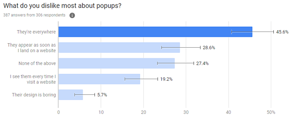
- Extensive use of poorly constructed popups
- Poor copywriting
- Design is not lucrative enough
- Unnecessary things are included
- They are everywhere
- Sometimes unwanted & irrelevant things appear again & again
These are some of the reasons why users usually don't like or want to see pop-ups while browsing websites. But it's also true that by executing it properly & avoiding the above points, your pop-up may perform amazingly. So, as an online shop owner, it's mandatory for you to know the smart way of using pop-ups.
Okay, now let's check out the effective ways of using the pop-ups on your online stores so that it can easily help you to occupy the highest customer attention.
So let's get started!
01. Let Your Audience Relate, Understand & Interact
The first and foremost thing you have to do is give your users a minimum time to understand your pop-ups intention. In that case, set the least time in between your pop-up so they can view, understand, and get interacted with your approach.
Following this trick, you can easily win your user's heart. And in the end, you are able to scale up your sales on your eCommerce store by collecting customer's attributes.
However, let's take the example of Onnit Labs, a vitamin & supplement company. On their website, you'll also notice a time-delayed pop-up. For instance, it waits for the customers to start their next search for products.
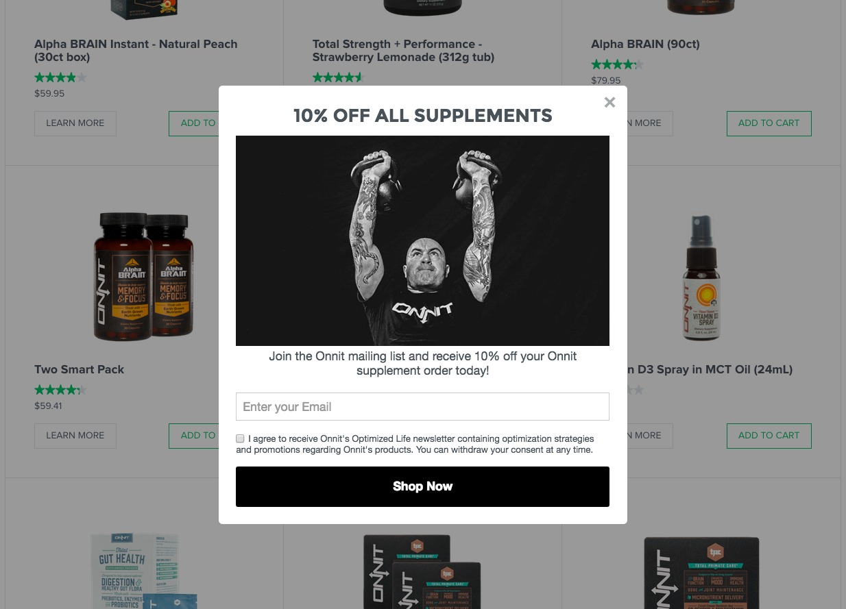
As a result, customers get a minimum time to browse or look for what they want. After that, they utilize their pop-up to ask users for sharing their email addresses or their other relevant information.
You may also like to read: How To Add Modal Popup In Elementor.
02. Use Audience Segmentation
In order to make your digital marketing efforts powerful, you need to segment your audience's persona according to their preferences & their last activities on your eCommerce. As a result, you can easily sort out your valuable users & show more relevant messages.
Let's see, what should you need to consider at the time of segmenting your audiences for delivering more relevant news through pop-ups
- Individualize your customers (male/female)
- Focus on their last purchased products
- Value their intention
- Find out what did they search for last time
- Track their location
- Try to know their interest
Moreover, try to be more logical & keep them in a funnel. So they can get a delightful journey while browsing your eCommerce store. In this case, it may require some extra effort, but you shouldn't mind that as the ultimate result will be in your favor, for sure.
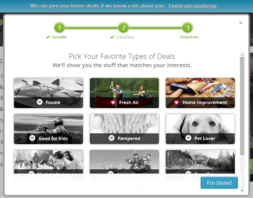
Let's take an example by GroupOn below. They kept their pop-up a little bit different, unlike others. In this way, customers will feel more special and happy to receive such a pop-up like the following one. Also, it will make their way easy & smooth to find desired products.
03. Try to Use Pop-up for One Time
In some cases, you don't need to display pop-ups on your website again & again. Especially for those users who have already signed up for your newsletter. In that case, you can follow the things below:-
- You can keep your email at the bottom that can display, ‘Have you received this email, or are you enjoying it? Sign Up here.”
- Also, you can use a static pop-up (generally in the footer part) where visitors can get your brand's newsletters, a VIP membership, special discounts, or more.
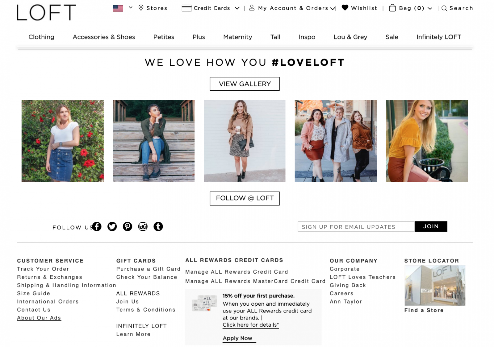
Let's take an example by LOFT, an online clothing company. Here, they have used their newsletter box in the footer part instead of a pop-up. Therefore, users can easily navigate or scroll down to the footer part, and also get themselves registered for the newsletter, if they haven't yet.
04. Provide Useful & Relevant Information
Instead of trying to force a sale, reach out to your customers in a positive way with some valuable information
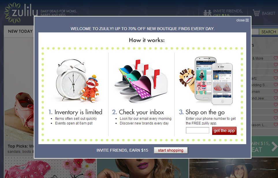
Pop-ups on websites should not always say, ‘Buy', ‘Buy', ‘Buy', rather you can make it less annoying & provide helpful information to your visitors. For example, you can share how your product works, a simple info graph, or any success story shortly.
In this way, you can smartly engage your visitors. Surely, this process will drive more conversions & sales in the long run. That's exactly what Zulilu did which can be seen in the example below.
05. Implement Target-based Popups
It seems very awkward to receive the same pop-up again & again. Smartly targeted pop-ups on websites can increase 418 sign-ups per month. For instance, it needs to be well-executed for getting continuous progress through your pop-ups.
That's why Sumo revealed a story regarding pop-ups:-
Targeting pop-ups can increase conversion rates by up to 50.2%.
– Sumo
Therefore, don’t just display the same popup everywhere. Rather you need to tailor popups so that they can appear on specific sections of your site. As a result, you will observe good subscription rates, in the end.
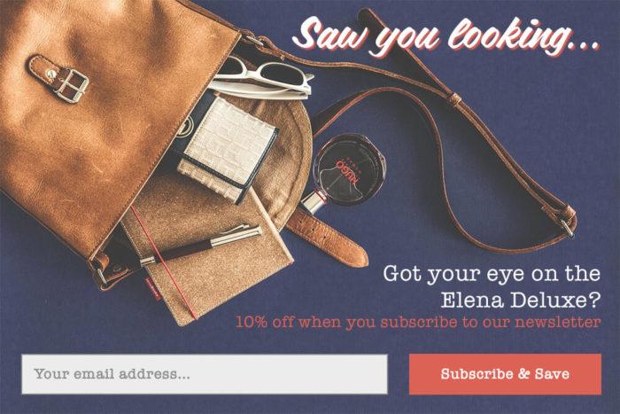
However, if users are looking for some specific products or items in your stores, that means they’re interested in it. Then after a while, you can offer them discounts, deals through a popup with some engaging messages like the one below.
Note: This process may look hard for you, but you can target categories than your specific products. On the other hand, you can test your criteria to see whether it drives more conversions or not.
Related article: How to convert more conversion with a powerful WordPress conversion tool
06. Capture Social Followers
As we discussed earlier, it's not wise to push sales with heavy messages all the time. Rather you can ask visitors to follow your brands through social platforms or channels. As a result, visitors will get to learn more about your products & company. Also, you can increase your social followers instantly by applying this trick smartly.
However, let's know a little more about the importance of social engagement these days mentioned through some valid points below:-
- Delivers social proof of your business
- Builds credibility, reliability, and trust
- Expand your marketing reach
- Cost-effective than traditional advertising
- Extends brand awareness
- Creates direct opportunity to interact with customers
- Builds a solid network
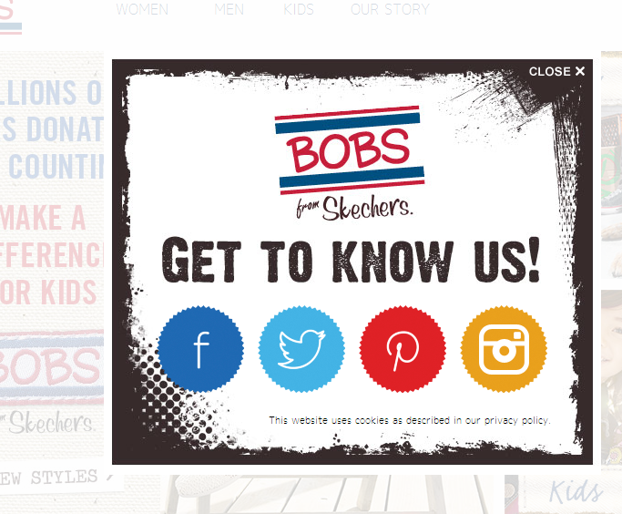
Considering the above benefits, Skechers applied the trick for their visitors. Here's an example that you can be comprehended easily. They introduced popups with social media buttons and they successfully managed to increase social media followers.
So, it's a secure way to expand your reach & maximize conversions without making your shoppers irritate.
How Top Brands Use Pop-Ups to Increase Sales

Before we show you how top brands utilize pop-ups for bettering their conversion rate, let's know a little more about some interesting stats & facts about pop-ups. Hopefully, this will assist you to use pop-ups on your eCommerce store accurately.
- Copyblogger found that popups quickly boosted their email opt-ins
- BitNinja extends its traffic by 162% using popup campaigns
- Popups roughly have a 2% click-through rate that is higher than any other ads
- Implementing a hover-style pop-up has the ability to double subscription rates without increasing the bounce rate.
Okay, enough about the stats & facts, now let's take a look at how some of the top brands utilize pop-ups on their eCommerce website.
01. Amazon
After you visit Amazon, you'll see a pop-up box asking you to create an account or sign in. Therefore, users who don't have an account in Amazon can easily get a notification for creating an account or signing in.

Another amazing thing you can notice is that there is an option for the product shipment, especially for abroad or international customers.
02. Kellogg’s Lightweight Pop-up Box
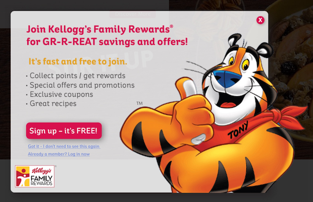
At Kellogg‘s website, you'll see a lightweight pop-up that presents just after the page load. In their pop-up, they offer users to sign up for ‘Family Rewards'. And after the registration process, you'll get special offers & coupons.
03. Soaked in Luxury's Pop-up Box with a Unique CTA Button
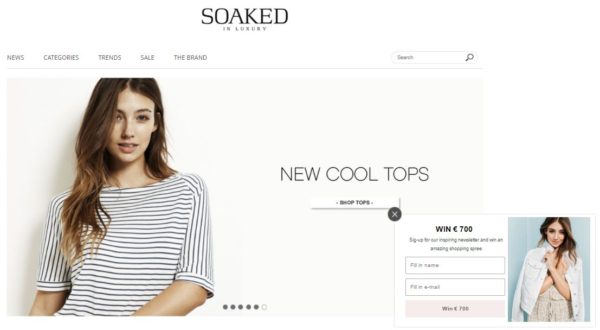
‘Soaked In Luxury‘ has smartly used the color combination on their eCommerce site. As you can see a white background all over which is very simple yet eye-catchy even when both designs of their website & pop-up are the same.
Unlike other eCommerce sites that ask users to ‘Sign Up', here Soaked In Luxury, provides a different CTA button on their pop-up box, “Win €700”. Actually, writing an engaging CTA copy with consistency can easily drive a ton of conversions. And that's what ‘Soaked In Luxury' did effectively
04. Nordisk Film Cinemas
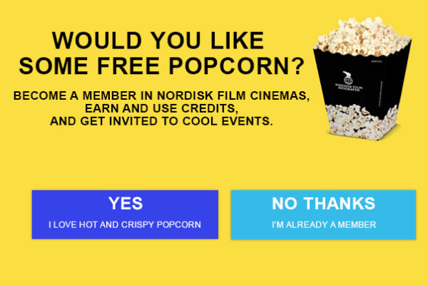
Now, what makes Nordish Film's pop-up so special? The catchy headline that directly connects with users. And the attractive content that explains what visitors will get after becoming a member. Lastly, they have added the engaging CTA button.
They’ve also included an image of popcorn which makes the popup even more overwhelming. As a result, utilizing this mantra they drive more conversions by grabbing the attention of their visitors.
05. Colgate's Lightweight Pop-up
Here in Colgate. you can also see an immediate lightweight pop-up after the page loads. The intention is known to all, capture email addresses, and generate leads through coupons, promotions & product updates.
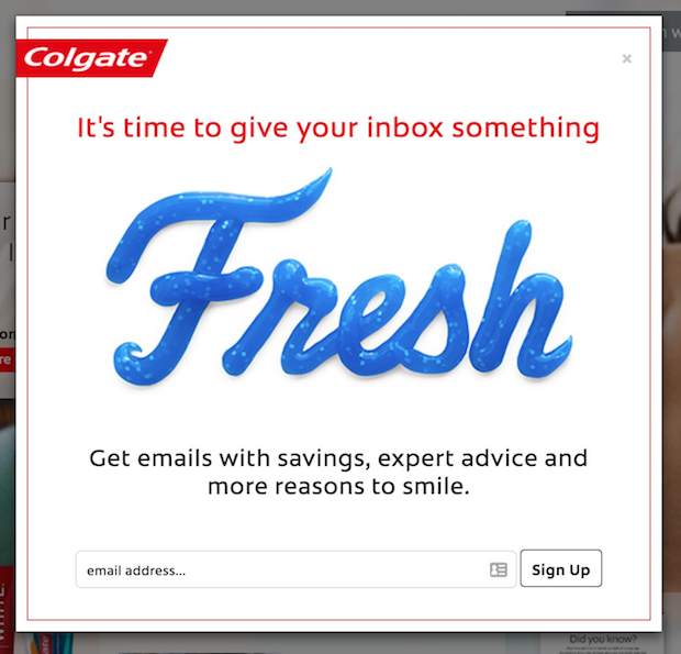
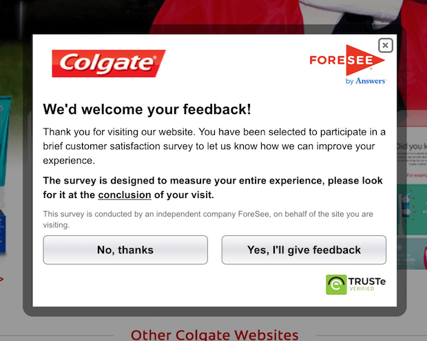
However, if you don't subscribe to their newsletter, and visit again, you'll see the pop-up below on their website. Actually, this is a nice way to interact with customers showing different pop-ups at different times.
From the second pop-up, they managed to improve their marketing strategy using some valuable information from the survey.
Colgate
So this is how some of the top brands utilize pop-ups to generate conversions and revenue. There are hundreds and thousands of examples like this that many other top brands use to acquire visitors, subscribers & improve their conversion rate eventually.
Things to Avoid While Using Pop-ups on Your eCommerce Store
However, a pop-up can be both your friend & foe. Either it can annoy your users & drive them away hurting your website's reputation or it can magically generate some valuable leads improving your conversions or sales. But whatever it may be, it solely depends on your effort & intention.
Always remember that, although you may make some mistakes while creating the first popup that may repel your valuable customers from you for some time. But you can always minimize that & easily learn from that mistake to apply pop-ups on your eCommerce website more effectively than before.
Learning from other's mistakes can create long-lasting success.
So let's check out the common mistakes that you should avoid while using the first pop-up on your eCommerce site.
- Not using personalize pop-up's copy
- Showing urgency in the Popup (Too Soon or Too Late)
- Keeping the CTA generic
- Providing everything at once
- Displaying irrelevant pop-ups
- Presenting the same popup on every device
- Not proofreading your popup copy
- Requesting too much information in the popup
Final Verdict
Well, finally the post has come to an end. Throughout this post, we have tried our best to give you an exact idea about the importance of popups and how they should be designed or used on your eCommerce website including some important aspects of the pop-up with live examples of top brand's popups practices.
Pop-ups with more context have higher conversion rates
Sumo
Therefore, it's high time to utilize pop-ups for your eCommerce site in the right way. So, follow the strategies that we talked about in this post and try to avoid mistakes while using pop-ups on websites.
Lastly, if you have anything to say regarding this post, please feel free to let us know with a comment below. We await your valuable feedback.😊

