
11+ UX Best Practices to Improve Your eCommerce Customer Journey
Have you ever left a website due to a poor navigation system or complex design pattern? Well, you are not alone on this list.
According to Adobe, 38% of online shoppers will leave a website if they find the design to be unattractive or complicated.
As you know, in today's fast-paced digital world, attention spans are very short and competition is very high. In order to keep the visitors engaged on your site, you have to ensure a seamless and enjoyable shopping experience for the users.
You must take good care of-
- Keeping the website design clean and easy to navigate
- Making the purchasing process as intuitive as possible.
The combination of great design and functionality heads your business towards great revenue.
In this blog, we shed some light on the top eCommerce UX best practices that you should follow to turn your traffic into sales.
What is User Experience?
User Experience (UX) is how a person feels when interacting with your website, page design, product layout, business values, and others.
Why Do You Care About eCommerce UX?
A large number of people are entering the eCommerce business and making the world more competitive. In order to keep your website standing out from the crowd, you must do something special.
One crucial differential factor could be eCommerce UX (User Experience). UX design determines how easy and enjoyable it is for users to navigate your website and make purchases.
On the other hand, with poor website design and experience, you will lose a lot of potential leads for being your permanent buyers. In fact, a report from HubSpot shows that 88% of consumers are less likely to return to a site with bad UX.
According to a study from the Oxford Journal Interacting With Computers:
The goal of UX design in business is to “improve customer satisfaction and loyalty through the utility, ease of use, and pleasure provided in the interaction with a product.”
For example, you are visiting a well-designed online shop full of a variety of amazing products. But you find it difficult to locate the products you are most interested in. It obviously ruined your interest in continuing on that site. Similar things can happen with your potential customers, too.
All in all, eCommerce UX design is about enhancing the experience that people feel while interacting with your products and making sure they find value in what you are offering.
Read Also: Why eCommerce Businesses Fail & How to Resolve Them.
What are the Core Elements of eCommerce UX?
eCommerce UX covers a wide range of aspects to ensure a positive and seamless online shopping experience for users. Here are key areas that eCommerce UX covers:
a. Information Architecture and Navigation
Information architecture and navigation focus on how well your store is organized. Categories and subcategories should feel natural. The search bar must show correct suggestions so users can quickly find what they are looking for.
Product pages must show clear details, helpful photos, and customer reviews so shoppers can make confident decisions. Explore the best practices for website navigation in WordPress.
b. Visual Design and Usability
It decides how pleasant and comfortable your store feels. A clean and consistent design builds trust and makes the site more enjoyable to use. The entire store should match your brand style so users feel connected to your business.
At the same time, the website must be responsive so it works smoothly on phones, tablets, and desktops. Explore the secrets of how to improve the visual design and usability of a website.
c. User Interaction and Flow
Visitors should be able to filter products by price, category, color, brand, and other options without feeling lost. Once they like a product, adding it to the cart and checking out should be simple and free from surprises. Hidden fees or confusing steps often scare users away.

d. Content and Communication
Product descriptions must be short, easy to understand, and explain how the item benefits the customer. Support options like live chat, email, or phone should be easy to find. Personalization should include recommended products or relevant offers, making the shopping experience feel more human. Check how to run an effective email marketing campaign.
e. Beyond the Purchase
A strong post-purchase system keeps customers happy and brings them back. Order tracking should be simple. Returns and exchanges must also be easy because complicated steps reduce trust. Stay connected through follow-up emails, updates, or thank-you messages.
Top 12 eCommerce UX Best Practices
Below are the 10 eCommerce UX best practices that help you to explode your sales. Go through this list, and implement them on your site:
- Use Full-screen Welcome Mats to Showcase A Product or Offer
- Make Sure Your Site Takes Less Than 3 Seconds to Load
- Include Easy Navigation on the Homepage / Landing Page
- Use High-Quality Product Images & Detailed Product Descriptions
- Use a Clear Call to Action to Guide Your Customers
- Increase Customer Retention with Easy Customer Support
- Include Social Proof to Boost Customer Confidence
- Offer Multiple Payment Methods For Your Clients
- Don't Force Your Users to Register Before They Buy
- Introduce a Prominent Sales and Specials Section
- Implement Smart Personalization
- Introduce Micro-Interaction System
Now, let's discuss each of the above-mentioned points in detail and get started with the first point-
1. Use Full-screen Welcome Mats to Showcase a Product or Offer
Do you know that a large portion of the traffic leaves your website without taking any action? That's quite frustrating after putting in too much effort. Get to relief, using a welcome mat can help you in terms of grabbing your visitors' attention efficiently.

A welcome mat is a full-screen dynamic overlay to showcase any personalized message or campaign that relates to the visitors to your website. You can display any flash sale, newsletter sign-up form, special deals, or other calls to action to welcome your users. It helps you get more newsletter subscribers, eBook downloads, product sales, and more.
2. Make Sure Your Site Takes Less Than 3 Seconds to Load
Page loading time is definitely one of the most crucial aspects of the success of an eCommerce business. A fast-loading website improves SEO and provides a better experience to visitors. You may have a website with great content, but if it is slow, your visitors get frustrated and leave the site immediately.
According to Maile Ohye from Google-
Two seconds is the threshold for eCommerce website acceptability. At Google, we aim for under a half second.
In fact, 40% of visitors abandon a website that takes more than 3 seconds to load- I bet you also do the same. It clearly shows how important it is to take care of the content that can affect your website's loading speed.

So it's extremely important to optimize your site performance and speed. Fundamentally, it has a direct impact on your sales. An optimized website will make your visitors' journey simpler and influence them to buy products from your digital shop. So you can convert more traffic into loyal advisors.
3. Include Easy Navigation on the Homepage / Landing Page
To get engaging traffic, give your customers a seamless browsing experience. The best way is to keep your website's design simple and clean. Don't stuff your website with everything so people get confused.
Moreover, too many choices can overwhelm your customers and misguide them in order to make the right decision.
According to the reports of Forrester Research, you can increase customer conversion rates to 400% by developing a frictionless UX design.
Organize all content so people can find their desired products quickly. And also complete the purchase through a simple check-out process, including payment. These factors are highly crucial for increasing your customers' retention rate.
Remember, a complex process can decrease your customers' satisfaction level and they won't come back to your site again.
4. Use High-Quality Product Images & Detailed Product Descriptions
No doubt, a clear and high-resolution image is the core attention point of an eCommerce website. Since people can't touch or verify a product before buying it in an online shop. The only way to understand the quality is through the product image.
Using high-quality and detailed descriptions conveys professionalism and evokes trust.
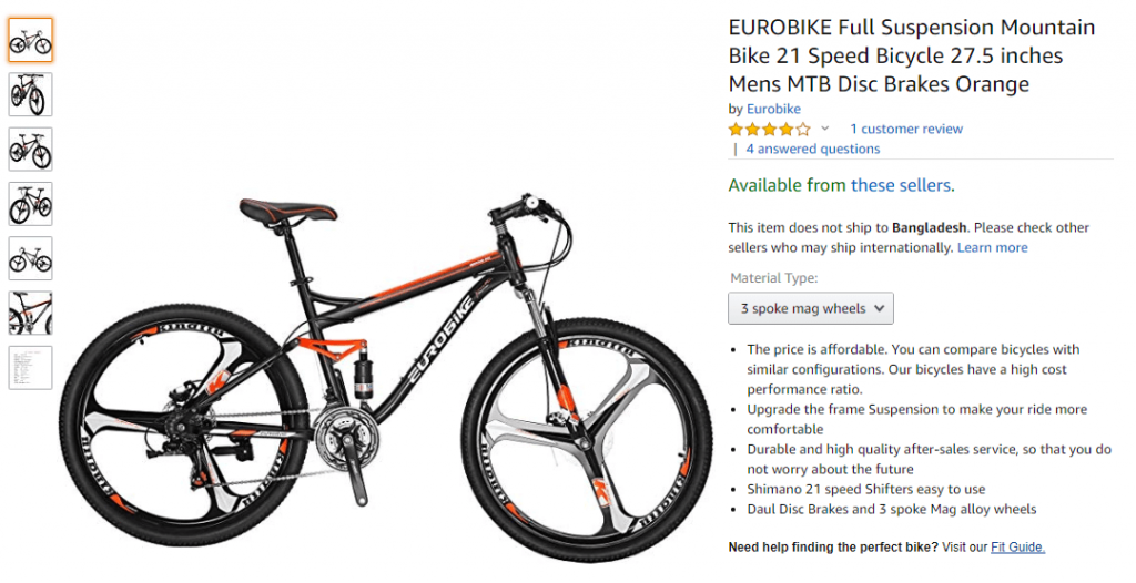
Besides, you should include photos from different angles so people can get an overall view of the products. This type of interaction helps a shopper decide to buy and feel confident in that decision.
5. Use a Clear Call to Action to Guide Your Customers
Use actionable CTAs (call-to-action) to increase conversions on your storefront. You can utilize both highlighted text and appealing buttons to attract more people to a specific part of your website. And convince them to take the next step you want your visitors to take.
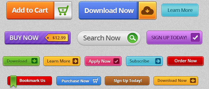
Actionable tips for your CTAs-
- Keep your CTAs short and influential
- Make it easily visible to the visitors
- Place them where visitors often navigate
Moreover, you can run A/B tests on the format and placement of CTAs. Observe the impact and make the final decision based on which combination is most profitable for your online shop. Also, you can try different text, color, or texture combinations to see how visitors' behavior changes.
Use these words to make your CTAs more powerful:
- Action words/verbs such as ‘Buy,' ‘Shop,' ‘Grab The Deal,' ‘Get,' etc.
- Urgency words such as ‘Now,' ‘Today,' and ‘Last Day'
- Essential assistance like ‘free PDF,' ‘Free Customer Service,' ‘Expert training,' and so on
After driving traffic to your site, the next challenge is to convert them into customers. Optimized CTAs can help you boost the conversion rate vastly.
Struggling to create engaging limited-time deals for your eCommerce store? Check this guide & unveil 7 proven ways to write a discount offer that converts.
6. Increase Customer Retention with Easy Customer Support

Although you may have a target customer, you do not know who is visiting your eCommerce. After having a well-designed site, people love to hear or discuss the products from a person. Good customer support can make the task easier.
UX often faces the challenge of not having customer support. As visitors prefer to talk with someone who knows the products better, a live chat can be efficient from this point of view.
Even if the live chat is not feasible for your particular case, other easy customer support options like email can be proven very effective. Customer support always boosts eCommerce sales.
7. Include Social Proof to Boost Customer Confidence
People love to get recommendations or reviews from real buyers before they purchase. That's why social media proof, like news feeds, users review, subscriptions, likes, shares, etc., often plays a huge role in the customer's mind.

Also, you can include endorsements from influencers or industry experts to build trust with potential buyers.
Social proofs assure the customers about your authenticity and quality. It indicates what kind of products and services you've provided to your previous customers. Appropriately, the potential customers start feeling comfortable shopping for you. As a consequence, the sales start multiplying. This is one of the significant eCommerce UX best practices to create a loyal customer base.
Read more: Apply Social Proof Marketing To Boost Your WordPress Plugin & Theme Sales.
8. Offer Multiple Payment Methods For Your Clients
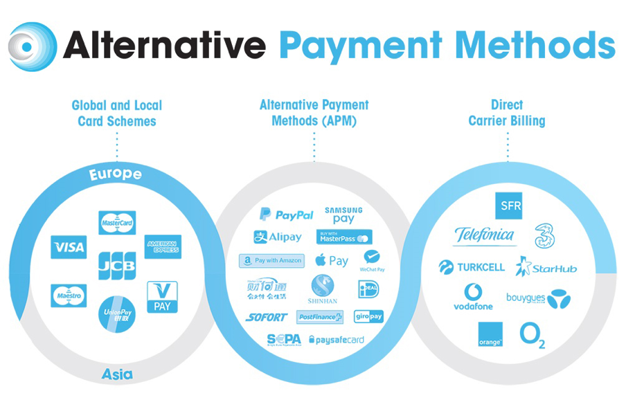
Including all the popular gateways will make your customers' lives easy. Most people love to purchase from those sites that offer their preferred payment methods. That's why try to add all the possible payment systems that your potential customers may prefer to use. Considering the user base and location of your business in terms of choosing the payment options, indeed.
According to Baymard, some people leave checkouts because they don’t find their desired payment method (8 percent) or because their credit card is declined (4 percent).
However, it is a common trend among people that they don't want to share their payment information online. As a result, they leave the site without buying anything. So, spend a good time interacting with your possible leads and gain customer trust for your digital shop.
Apart from this, you should accept multiple currencies. Hence, people around the globe can interact with your site trouble-free. Remember, more options will generate more prospects.
9. Don't Force Your Users to Register Before They Buy

In this modern era, everyone has a busy schedule. They always prefer a simple way to achieve something big. As a digital shop owner, you must consider this human nature to establish a successful online business. Shoppers have many reasons to dislike site registration. If they just make a one-time purchase or a guest purchase, they may not plan to return to the site again.
Most of all, registration involves extra steps, extra hassles, and increases the possibility of unwanted errors. The higher the interaction cost, the fewer people will complete a process. This is true for any user interface step, especially for eCommerce sites there is a direct connection between user hassle and lost sales.
A recent study shows that almost 28% of buyers abandon their carts behind for checkout annoyances.
Guest checkout with optional registration will simplify the purchase process on an eCommerce site. Instead of forcing people to do unwanted registration, encourage users to register when they feel comfortable.
Therefore, minimize the form elements that a customer needs to fill up before purchasing. Ask only the selective information that requires only a few seconds to attend. Let's move to the next eCommerce UX best practices-
10. Introduce a Prominent Sales and Specials Section
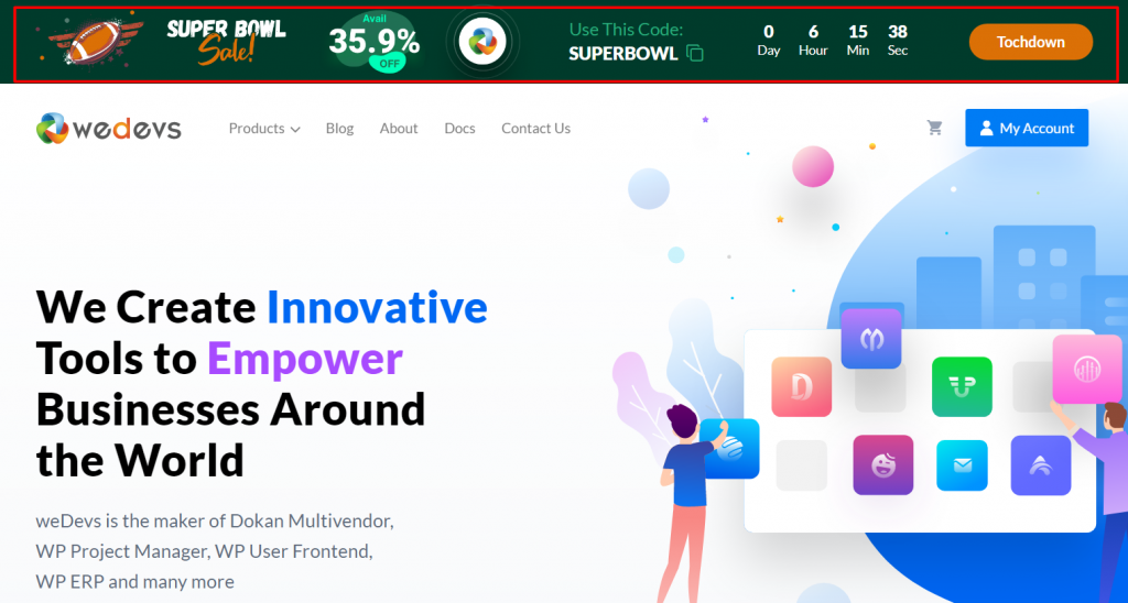
It takes only 50 milliseconds for users to form an opinion about a website that determines whether they'll stay or leave. As an online trader, you have less than 50 milliseconds to convert your visitors into customers.
The sales or home page plays a vital role in engaging the customer for a longer time. So you can run a special day campaign on these pages to attract more traffic to your site.
People are mostly attracted by the special section of eCommerce sites if it contains the latest and greatest offers. It often ends up with a beneficial decision.
Read More: 8 Effective Ways to Increase Your Average Order Value.
11. Implement Smart Personalization
Many online stores treat every visitor the same way. But not all users come with the same needs, interests, or buying intentions. This is where personalization becomes very powerful. Smart personalization means showing the right content to the right person.

It makes the shopping journey smooth and enjoyable. For example, you can show ‘Recently Viewed Products,' ‘Recommended For You,' or ‘Complete the Look' blocks based on the user’s activity. You can also personalize homepages, product grids, and promotions by using browsing history or past purchases.
This makes your store feel more human. It also increases trust because visitors feel understood.
It reduces friction and helps users find what they want faster. In the end, it brings more sales and repeat visits. Here's how to build an eCommerce site with WooCommerce and Elementor.
12. Introduce Micro-Interaction System
Micro-interactions are tiny actions or visual signals that guide users during their journey. These may look small, but they make the shopping flow smooth and stress-free.
Examples include:
- A button that changes color when users hover
- A small shake when a form field is empty
- A progress bar during checkout
- A heart animation when someone adds an item to the wishlist
- A clear confirmation when an item is added to the cart
These small moments help users understand what is happening on the screen. They also prevent confusion. When users see these micro signals, they feel more confident during the purchase process.
A clean and useful micro-interaction system reduces errors, increases trust, and keeps the users engaged from browsing to checkout.
FAQs on eCommerce UX Best Practices
User experience refers to how users interact with a website and their overall satisfaction with the process. According to a study by Forrester Research, improving the user experience on an eCommerce site can increase the conversion rates up to 400%.
A good example is Amazon's “1-Click” ordering feature. This simplifies purchasing for customers and increases convenience.
By implementing the right UX design strategies, businesses can create an online shopping experience that is engaging, efficient, and enjoyable. UX design focuses on creating designs that prioritize users' preferences and make their experience as easy as possible.
Moreover, successful UX design strategies simplify the checkout process, provide options for delivery and payment methods, and offer personalized product recommendations.
Furthermore, incorporating customer feedback through surveys or reviews can help you identify areas for improvement. Overall, it helps you to improve customer loyalty and ultimately drive sales growth for your online business.
Improving the user experience (UX) of an eCommerce website is crucial for increasing sales and customer satisfaction. Here are some ways to improve your eCommerce website's UX:
1. Ensure that your site's navigation is easy to use and intuitive
2. Make sure your search bar is visible and functional
3. Minimize the number of steps required during checkout
4. Use high-quality images to visualize the product better
5. Write accurate, informative, and concise product descriptions
6. Ensure that your site is optimized for mobile devices
7. Incorporate social proof elements
Follow These eCommerce UX Best Practices to Explode
In layman's terms, the core idea of a typical user experience (UX) design is to enter into the head of your end-user and figure out what will provide them with a simple, logical, and enjoyable shopping experience.
Are you looking for useful tips & tricks to elevate your eCommerce sales? Check these 7 effective marketing strategies to multiply your online sales.
As a digital shop owner, you must take care of your users' experience; otherwise, it hurts your sales. The more you can make your customers' journey simpler, the more revenue you will generate. It includes interactive design, information architecture, visual design, easy navigation, and overall website transaction.
Don't use any complex process, high contrast color, low-resolution image, or hard words inside your online shop. Just understand your clients' needs thoroughly and make sure it reflects on your content.
Still, have any confusion in mind? Use the comment section below to share your thoughts with us!


