Hacks And Techniques for Beautiful Form Design in WordPress
If you are a webmaster or a web admin, you will often need to use quality web forms to collect data and information from your visitors. This is why it stands to reason that whenever you are going to create a web form you must craft it in an organized manner so that it becomes easier to understand and more convenient for the audience to answer the form quickly.
This article will walk you through the way of creating a beautiful form design that will ensure proper user engagement.
Here are 16 tips for beautiful form design
To maintain the cleanliness of your WordPress form you can consider our rule of thumb. Here are a set of rules that will help you craft squeaky-clean website forms:
- Choosing form type
Determining the type of your form tops everything. For instance, if you are going to make a subscription form then only adding fields like email and full name will be enough. However, an online screening test may require a good number of fields in your web form to fit a set of questionnaires.

- Knowing who your audience is
Before you create a form, you must know who your audience is. If you want to create a form for the job candidates then adding merely an email and the full name fields won't be a good idea. Contrary to the subscription form, you must add a number of fields to get enough information from your employees.
- Choose the appropriate field according to your question type
Unlike a physical paper, you can harness the power of machine language to collect data from your users in a more efficient and subtler way. Instead of adding plain question fields and a text field to answer, you can use the following three field options:
- 1. Multiple choice fields:
When the user has to select only one option from more than two options then you can use multiple choice field option for your question.

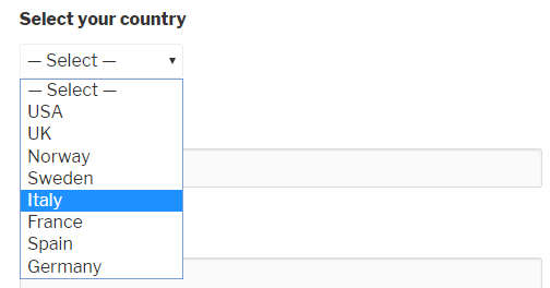
- 2. Dropdown menu:
When there are too many options to select a particular one, it would be pretty smart to use a drop-down menu so that you can avoid the clutter of the circle icons of radio boxes.
- 3. Checkbox fields:
When the user has to select more than one item at a time from a given series of options, using checkboxes come to the fore. Here is an example of checkboxes where the user can input more than one option:

- Using conditional logic to hide unnecessary elements
To ensure professionalism in creating web forms you can use conditional logic with a view to hiding irrelevant options. The best part is that you can create conditions on a certain set of events. For instance, if your users click on the other option he will get a text box to input the answer that is not included in the radio box:
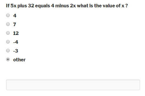
The hidden options can only be shown by the triggering of those events (Here, “other” is that event) by a user. You can follow this link to learn more about conditional logic.
- Adjusting text field size according to the question type
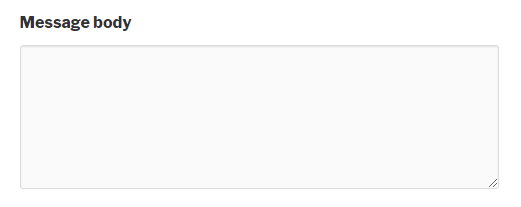
Adjusting text field size according to the question type directs your user to guess the amount of text you are expecting from him/her.
- Apply vertical ordering approach for the fields
According to CXL, users are more prone to fill out the linear forms (single column) forms than to fill out multi-column forms. Here is an image of a single column and a multi-column form:
- Customize button labels to direct the user
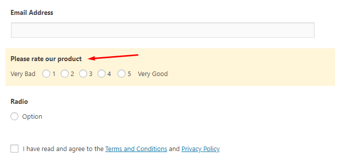
A form builder may have buttons with predefined labels which might not serve your purpose. This is why you should want to customize the labels of the buttons.
- Using automatic calendars to pick a date, month and year
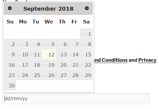
The advanced form builders are capable of using JavaScript to the max. The point is that when a user clicks on a date field, they get a calendar popped out of the screen. This interactive calendar will help the user input his/her desired date with just a single click of the mouse – meaning that manual typing is not important here.
- Using reCaptcha
The trend of using reCaptcha in web forms has become really popular nowadays. Though it doesn't help you to clean your web forms, it is the best way to save your web forms from getting vandalized by online spambots and spammers.

- Use help text and placeholder:
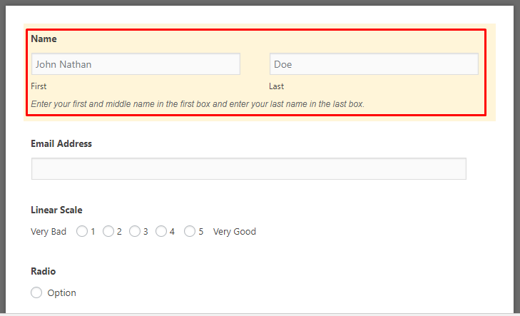
Not all visitors are habituated to filling out web forms. For good reason, you will have to use help text and placeholders so that you can assist those fledgling users to fill out the forms in an unobtrusive way.
- Use links to help the user with additional information
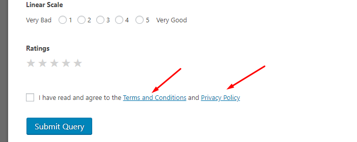
For terms and conditions or things like that, you can use links to help the user read those text by navigating to another page.
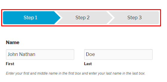
- Use multistep forms where necessary:
In case your form contains a lot of sequential fields, you can use the multistep functionality. Here is a screenshot of a form that contains multiple steps:
- Use thank you page:
You should show a thank you page right after your user submits the form. The thank you page helps the user to be confident that the form data was successfully sent to the website admin.
- Populate a field if you are going to share your form:
How about sending your contact form and surprising your recipient with dynamic field population? To do so, you will only need to use a parameter name and enter a value for that parameter and you are done with auto-populating a field.
- Use of asterisk mark to make a field mandatory:
Asterisk is a neat tool to make a field compulsory. We love to take emails from our customer when we are conducting research or customer survey and guess what – you can force a user to enter his/her email address in the form.

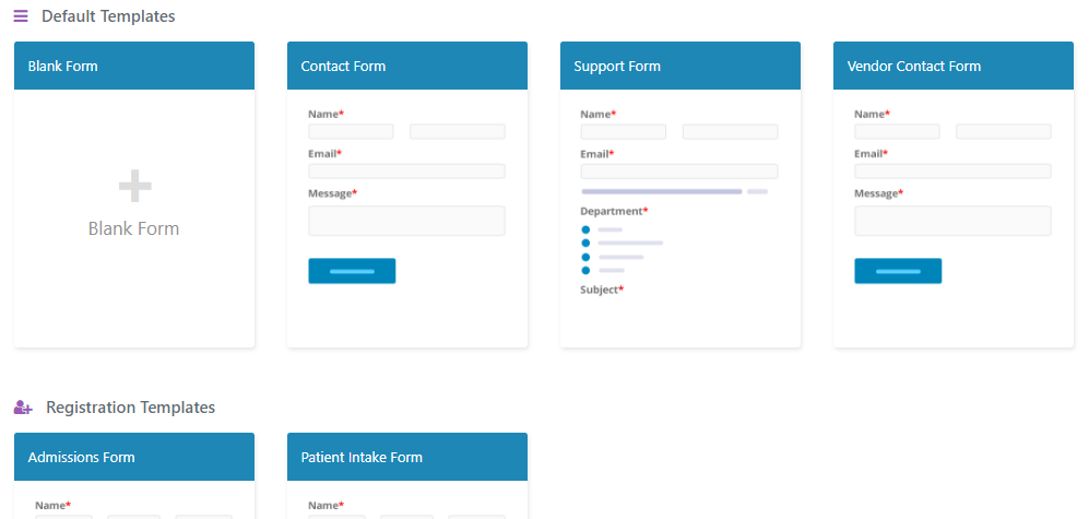
- Application of predefined templates:
If you are not DIYer type then you can go for predefined templates that come with the WordPress form builders. These templates will allow you to design beautiful website forms real quick and definitely maintaining the aesthetics as well.
Wrapping up
The hacks that we mentioned here are derived from our practical experience – not just from theories only. That being said, the form design process is continuously changing with time. For example, the use of reCaptcha has really gained the ground nowadays.
But, if you are going to apply these, make sure that you are doing split tests to determine which approach works best. Our earnest hope is that with these tricks, you will be able to convert your leads at a much higher rate than the one you were doing before reading this article.

